
An image/video gallery component configurable with minimal HTML code.
Features:
- navigation by onscreen controls, keyboard or gestures
- thumbnails carousel
- images with customizable title/description overlay
- MP4, WebM, and Ogg videos
- youtube videos
- fullscreen mode
- inline / detached mode
- automatic play/pause when entering or going off-screen
Usage
1. Import media-browser module
<script type="module">
  import "https://zuixjs.github.io/zkit/lib/1.2/components/media-browser.module.js";
</script>
2. Add component to the page
<media-browser z-context="media-browser"
               :inline="true" :slide="5000">

    <!-- List of images/videos (#media container) -->
    <div #media>

        <!-- Example image item -->
        <article>
            <h1 #title>Title</h1>
            <h2 #description>Description of the image.</h2>
            <!-- Image thumbnail url -->
            <img #preview src="https://picsum.photos/400/300/?image=201">
            <!-- Full-size image url -->
            <a #url href="https://picsum.photos/1600/1200/?image=201">Open media</a>
        </article>

        <!-- Example video item -->
        <article data-type="video" slide-interval="15000">
          <!-- Video thumbnail url -->
          <img #preview src="sample/images/BigBuckBunny.jpg">
          <!-- video URL -->
          <a #url href="sample/BigBuckBunny.mp4">Open media</a>
        </article>

        <!-- Example YouTube video item -->
        <article data-type="video-yt">
          <!-- Video thumbnail url -->
          <img #preview src="https://img.youtube.com/vi/IdtM6OPdaio/2.jpg">
          <!-- YouTube video URL -->
          <a #url href="https://youtu.be/IdtM6OPdaio">Open media</a>
        </article>

    </div> <!-- end of #media container -->

</media-browser>
1. Include zuix.js library
If not already included, add the following line right before the end of the head section in the HTML document:
<script src="https://cdn.jsdelivr.net/npm/zuix-dist@1.2.7/js/zuix.min.js"></script>2. Add the media list markup
Put inside the field media the markup defining image and video list.
<div z-load="https://zuixjs.github.io/zkit/lib/1.2/components/media-browser"
     z-context="media-browser" :inline="true" :slide="5000">

    <!-- List of images/videos (#media container) -->
    <div #media>

        <!-- Example image item -->
        <article>
            <h1 #title>Title</h1>
            <h2 #description>Description of the image.</h2>
            <!-- Image thumbnail url -->
            <img #preview src="https://picsum.photos/400/300/?image=201">
            <!-- Full-size image url -->
            <a #url href="https://picsum.photos/1600/1200/?image=201">Open media</a>
        </article>

        <!-- Example video item -->
        <article data-type="video" slide-interval="15000">
          <!-- Video thumbnail url -->
          <img #preview src="sample/images/BigBuckBunny.jpg">
          <!-- video URL -->
          <a #url href="sample/BigBuckBunny.mp4">Open media</a>
        </article>

        <!-- Example YouTube video item -->
        <article data-type="video-yt">
          <!-- Video thumbnail url -->
          <img #preview src="https://img.youtube.com/vi/IdtM6OPdaio/2.jpg">
          <!-- YouTube video URL -->
          <a #url href="https://youtu.be/IdtM6OPdaio">Open media</a>
        </article>

    </div> <!-- end of #media container -->

</div>
Option attributes
z-context="<context_id>"optional
identifier name to be used to access this component from JavaScript.:on:<event_name>="<handler>"optional
set handler function for event<event_name>:inline="<show_inline>"optional
if set totrue, the media browser will be displayed inline rather than detached. The default value isfalseand
the media-browser will open only programmatically in fullscreen.:slide="<interval_ms>"optional
enables auto-slide mode. The value of the attribute indicates the amount of milliseconds to pause between each slide.
A different sliding interval can be specified for each item by adding theslide-intervalattribute on the item
with the amount of milliseconds to wait before next slide.:button="'<button_name>'"optional
The<button_name>associated to the element that will open the media-browser when clicked.
The attribute#<button_name>must be added to the button element. Only works in detached mode (not inline).
Events
open- occurs when the media-browser opensclose- occurs when the media-browser is closedfullscreen:openfullscreen:closecontrols:hidecontrols:showpage:changerefresh:activerefresh:inactive
Example 1 (inline)
Using :inline attribute set to true.


Example 2 (detached)
Without the :inline attribute and using the :button option. In this case the media-browser is not visible in the page unless the button is clicked.
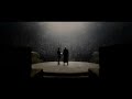
The Bridge
Tip: navigate with gestures or keyboard arrows.
Highway
Tip: hit space bar or tap to toggle overlay.
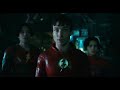
Wonders
Tip: not just pics, YT videos too (see next).
 Open media
Beams of light
Tip: video play/pause on focus/blur.
Nature
Tip: only minimal HTML needed to setup this gallery.
 Open media
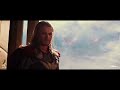 Open media
Multiple instances of the media-browser are allowed on the same page.
Scripting
Get a reference to the component instance:
zuix.context('media-browser', (mb) => {

  // store a global reference for later use
  self.mediaBrowser = mb;

  // open the media browser
  mediaBrowser.open();

});
Methods
// show the media browser
mediaBrowser.open();

// hide the media browser
mediaBrowser.close();

// get the current page
let currentPage = mediaBrowser.current();

// set the current page
mediaBrowser.current(4);

// go to the previous page
mediaBrowser.prev();

// go to the next page
mediaBrowser.next();

// show/hide/toggle controls overlay
mediaBrowser.showControls();
mediaBrowser.hideControls();
mediaBrowser.toggleControls();

// set fullscreen mode
mediaBrowser.fullScreen(true);